Table of Contents:
- Guide Users’ Eyes with Visual Flow and Direction
- Use Size and Scale to Create Emphasis
- Apply Contrast for Clear Differentiation
- Use Alignment and Grid Systems for Consistency
- Leverage Typography to Establish Hierarchy
- Create Focal Points with White Space
- Get Visual Hierarchy Right—With Content Development Pros by Your Side
- Contact CDP Today!
Have you ever noticed that some websites are a bit like digital jungles? Or at least, that’s what the impression you’ll get while trying to navigate through their chaotic mess of elements! If you’re wondering why that happens, sites like that are missing a certain secret sauce - visual hierarchy, the unsung hero of web design.
When done right, visual hierarchy acts like a brand new highway with clear signposts guiding users to where you’d like them to go. It’s something every website owner needs to focus on, so today, we’re going to talk about 6 crucial tips you can use to create intuitive, user-friendly experiences! These tips come straight from the web design agency playbook, so trust us when we say they’ll take your site to a whole new level. Let’s get into it!
Guide Users’ Eyes with Visual Flow and Direction
There’s a pattern to how a user’s eyes drift across your webpage. In the world of web design and development, experts leverage this pattern by implementing one of two layouts: the F Layout and the Z Layout.
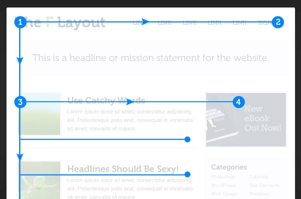
Here’s an example of an F Pattern layout:
[via Envato Tuts+]
In F Layouts, the idea is that the user goes through the content with a top horizontal scan, followed by a middle horizontal scan, followed by a vertical scan along the left side of the page. It works great for content heavy sites where you want users absorbing key information quickly. In the above example, the user's eyes go from points 1 to 2 (the top horizontal scan), followed by 3 to 4 (the middle horizontal scan).
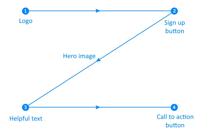
As for the Z Pattern layout, here’s what it looks like:
[via UX Planet]
Here, the scanning pattern clearly resembles the letter “Z”. Users go through the page with a left to right top horizontal scan, a top right to bottom left diagonal scan, and finally another left to right horizontal scan on the bottom of the page. If you’re working on a simple, visually driven site, you might prefer the linear progression provided by a Z Pattern. Adding visual cues (like the hero image) helps guide users along the diagonal path.
Use Size and Scale to Create Emphasis
Elements like headings and CTAs need to attract attention, and since the human eye tends to drift towards the largest elements on the page, strategically adjusting their size can massively boost retention rates. After all, 94% of visitors base their impression of a website on design-related factors, so if you manage to grab their attention, the battle is already half won.
However, it’s important to take scale into account as well. You might want your CTA to stand out, so placing it in a larger field is non-negotiable, but the web copy ideally shouldn’t take up too much real estate on the page. It’s all about creating contrast to guide a user through your website, making their visit a journey that could potentially end in a conversion or some other desired action.
Speaking of contrast, size isn’t the only area where it matters.
Apply Contrast for Clear Differentiation
About 39% of users say that color is the most important aspect of web design, and it’s easy to see why. Color plays a vital role in human psychology, with studies showing that it can impact your mood and influence your behavior.
Now, we’re not just talking about using the right colors here (although you might want to avoid yellow if you can help it). Regardless of what color scheme you choose, there should be enough of a contrast to maximize readability by making the text pop.
And it’s just about text either! CTAs and other crucial elements that you want attracting attention should contrast with the overall color scheme too. Try not to make the colors clash too much; instead, consider using a brighter, bolder shade for CTAs and headings, and make sure the background color doesn’t drown out your text. After all, if people don’t read your web copy, there’s hardly any point to them visiting your website now, is there?
Also, in case you’re having trouble nailing the web copy for your landing page, check out our blog post on writing landing copy that converts!
Use Alignment and Grid Systems for Consistency
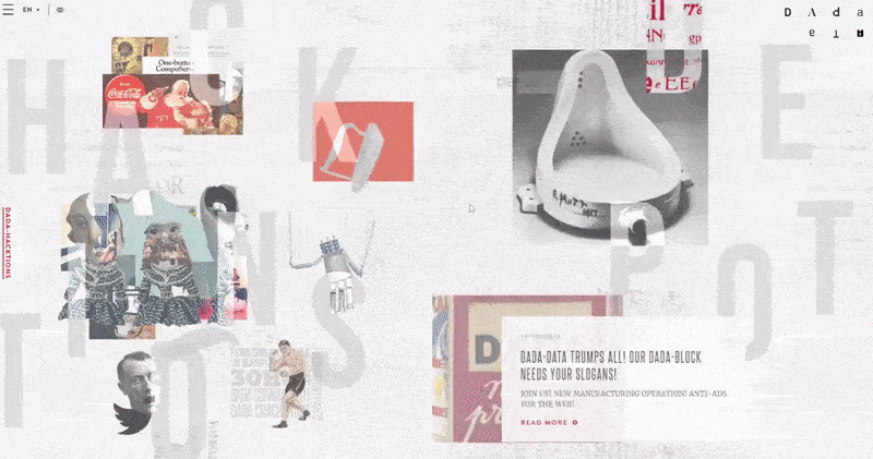
Neatly aligned grids are a great way to establish hierarchy in your web design, but that doesn’t necessarily mean maintaining symmetry. Here’s an example of a fashion magazine’s web page that uses asymmetrical grids to great effect:
[via Dada Data]
Notice how the design creates impact and draws users in? That just goes to show that asymmetrical design can be a powerful tool when used correctly! Of course, it’s a tool best used sparingly, especially if your primary focus is providing information. Here’s an example of symmetrical grid design:
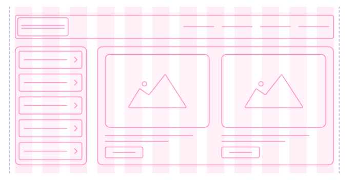
[via Muzli]
In the above example, everything is perfectly aligned and consistent. The user’s eyes naturally go towards the largest elements first, after which they look at the menu on the left and the elements directly below the images.
Leverage Typography to Establish Hierarchy
Not all of your text will hold the same level of importance. 80% of visitors will only read your headlines, so you’ll obviously want to make them stand out. This ensures that they absorb the gist of the text, even if they don’t read it all the way through.
It’s best to split your text into primary, secondary, and tertiary levels of importance. Headlines and CTAs hold the most importance, followed by internal links, and your body text, as informative as it might be, inevitably holds the least amount of importance, since most site visitors will skim through it at best!
There are a few golden rules you can follow here. For example, using a bolder, larger font type for headings is a good place to start, although any fonts you use must be complementary. Using a lighter font for the body text allows the reader to go through your website in order of importance, which means they’re more likely to glean the information that matters.
Create Focal Points with White Space
It’s not all about splashing colors on every corner of the page. What you need are focal points, areas that a user’s attention is naturally drawn to, and you can achieve that effect with the strategic use of negative space.
Basically, negative space is the white or neutral colored area around the more important parts of your site, and there are a bunch of advantages to utilizing it. For starters, it helps prevent clutter and gives your web design some room to breathe. On top of that, it’s also known for reducing eye strain, which your visitors would greatly appreciate!
So, how do you implement negative space? Firstly, take a look at the spacing between each line of text. Is there enough space? Too much? There’s a sweet spot you need to hit, and you’ll know it when you look at it. Secondly, pad out the margins around your body text and graphics. This provides a better overall user experience, which incidentally is great for your SEO!
Interested in learning how to optimize your web content for SEO? Check out this blog post to learn 4 essential strategies.
Get Visual Hierarchy Right—With Content Development Pros by Your Side
Web design is hard, and in today’s world of fleeting attention spans and massive market saturation, it’s essential to get it right the first time. The good news is, Content Development Pros is right here to help you along your journey. We provide a comprehensive suite of web design services that can maximize your website’s potential by creating a visual hierarchy that will guide users through your text and toward your desired CTA. Whether you’re looking to increase web traffic or drive conversions, our web design team has got your back.
Contact CDP Today!
Give us a call at (877) 897-1725 to learn more about our web design services.